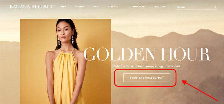
In terms of marketing, a “call to action” defines the way a user is urged to take a step or do something. It can be filling out a newsletter form, clicking on an “Add to Cart” ”button, subscribing, signing in, downloading something, or anything else. CTAs influence conversions directly. Thus, overlooking the wording you use on button texts, landing pages, or any other part of your eCommerce website is a big mistake. The same goes for choosing where to put them on the page and how they look.
In this article, we’ll introduce you to CTAs in online sales. We’ll give tips on how to find the right wording that actually works for your specific audience and how to use it as a powerful weapon. Furthermore, we’ll provide UX/UI recommendations on where to place your CTAs as well as share examples of what renowned brands select for their sites.
Introducing CTAs
Using calls to action wisely may be a big game-changer for an eCommerce business. It’s a vital part of store optimization along with image compression, design renewal, or a general technical upgrade to a Magento 2 PWA or a progressive web application on a different platform. It can even be said that CTAs are an entire science since it takes a lot of knowledge to get your audience to do what you want them to.
CTAs appear all across your online retail website and marketing channels. They fill clickable button texts, are present on your landing pages and banners, in pop-ups, emails, and often serve as PPC ads.
When using CTAs smartly and doing things properly, you can achieve a boost in conversions, traffic, sales, and any other thing you’re planning to accomplish.
A lot needs to be taken into account as you work on finding the right call-to-action copy and “look” for your eCommerce site. Some of them are:
- the words you use for your CTA (some phrases or words can be more effective than their synonyms);
- how your CTAs look (eg. buttons, their shape, size, color, the font, text length, using all caps or not, etc);
- where you position the CTAs on the store’s pages;
- how many CTAs you have (too many in a single place can cause confusion and disperses attention).
Choosing Effective CTA Wording
Although traditionally calls to action can be even long sentences, in eCommerce, they are mostly brief yet give clear instructions. Long-form CTAs are usually more common in sign-up forms, newsletter pop-up invitations, or blocks on landing pages.
Below we’ll share a couple of tips on how to find the right wording for your eCommerce CTAs and microcopy.
a) Highlighting a Perk
Offering some perks is a great time-proven “move” that increases CTA efficiency.
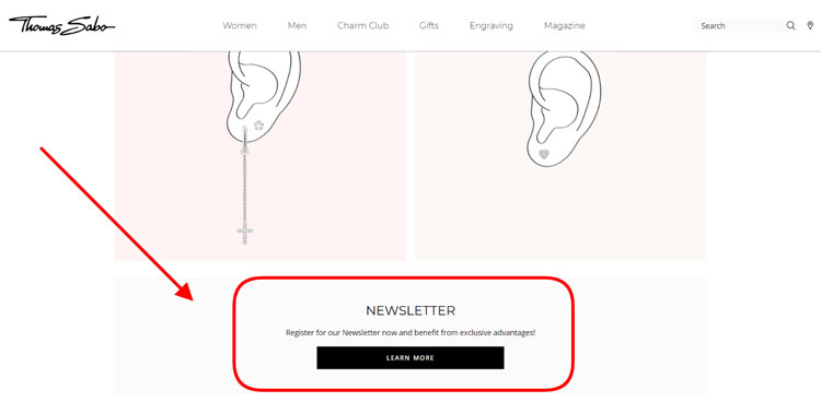
Case in point: below is a screenshot that was taken on the official Thomas Sabo eCommerce store. The “Newsletter” block on the page is easily visible. The short introduction allures customers to sign up for the send-out in order to receive benefits. To get them to the form or page with the details the button simply reads “Learn More”.
b) Stating Terms & Details
On the contrary, calls to action with specific details can be handy too. When the user is given key information clearly, this reduces anxiety.
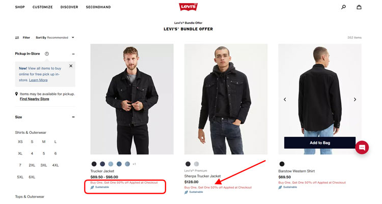
For instance, the official Levi’s online retail store uses this tactic. As shown on the catalog page, shoppers see a clickable red line of text that evidently explains the terms: “Buy One. Get One 50% off. Applied at Checkout”. When all the information is right there before you straight away, it urges you to take action.
c) Personalization
Frankly, there are words that resonate more with us and catch our attention. As such, when we’re addressed personally in calls to action, there’s a higher chance that we’ll notice. Especially, if we’re addressed in the first person.
This works similarly to the case with personal product picks that you pitch in “You May Also Like” sections of your online retail website. Or as with the product customization feature that merchants add to their stores that allow modifying the item’s look. According to the findings provided by Hubspot:
“Personalized calls to action perform 202% better than basic CTAs”
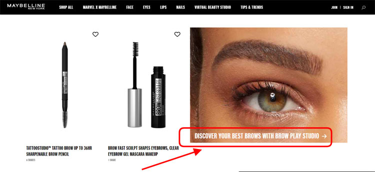
Here’s a CTA example that does just that. The Maybelline New York official website has a long-form call to action that addresses that one pair of eyes that’s looking at the screen. Using the phrase “Discover your best brows with Brow Play Studio”, they spark user interest. After all, many shoppers will be curious enough to click on the arrow and play around with the feature to see how they can change their eyebrows.
d) Making It Urgent
When something is available to us only for a limited time, we make decisions and take action faster.
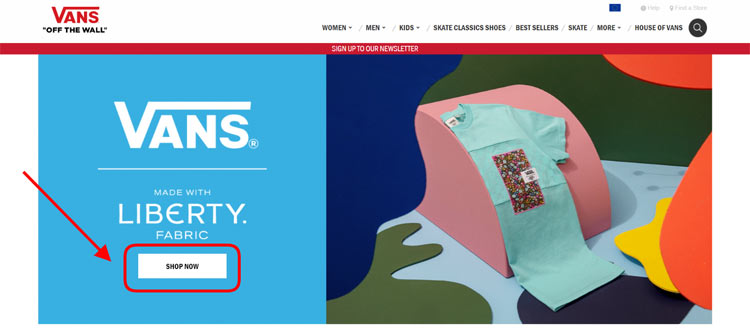
For instance, look at the screenshot below taken on the homepage of the official VANS online store. As you can see, the CTA is placed right within the main header area of the store. The call to action is placed inside a white rectangle that’s clearly perceived by users as a button. The button text reads “SHOP NOW”. Most likely that’s not without reason. The word “now” creates a sense of urgency, pushing the user to check out the products created with the aforementioned fabric.
e) Wordplay
Applying creativity to your calls to action won’t hurt either. Original phrasing that isn’t unhackneyed yet can become an additional eye-catcher.
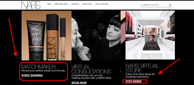
To give you an example, below you can see the CTAs that are used on the official NARS Cosmetics website. The homepage has a section devoted to their Matchmaker feature that allows users to find a suitable shade and formula of a foundation. To urge the site visitors to check out the tool, the call to action reads “Start Shading”. Similarly, the right block invites shoppers to browse the virtual 3D store. This CTA is playful: “Step Inside”.
UX/UI Best Practices for CTAs
What’s for colors, shapes, fonts, sizes, and placement, ideally, you want the CTAs to stand out and “play their role”.
Visibility is the major key here. Your store shoppers have to see the calls to action easily.
- Therefore, don’t make buttons too small (remember, some people are shopping from mobile devices).
- Don’t make them hard to read (say, using a grey text over a lighter grey background).
- Place them under headings or below short description texts (preferably with central alignment).
- Try to make the CTA look clickable (put it in a button or with underlined text that usually symbolizes a link).
- Green buttons are also considered quite efficient. But the golden here is using contrasting shades and colors, this way you can make the CTA really stand out and be noticeable.
- What’s for shapes, it’s hard to say which of the options is better, classic rectangular buttons or those with rounded corners. This website design is individual for every store.
Speaking of the best CTA shapes and colors for eCommerce stores, some options are believed to be more effective. Based on the information given by Quicksprout and Copyblogger:
“Red and orange CTAs can boost conversion rates by more than 20%. Placing CTAs in buttons can create a 45% boost in clicks.”
Keep it simple and readable, that’s the bottom line advice.
A/B Testing for CTAs
Sometimes using random wording isn’t convincing enough to motivate your clients to take the action you desire. The same can be said about the shapes, colors, and sizes of your CTAs: some are just catchier than others.
And let’s face it, tweaking just one teeny-tiny detail can already pave the way to big changes. So, instead of guessing which option works better for your eCommerce site, test it!
Thanks to A/B testing you can experimentally find out whether your “hypothesis” is right or not. There are many tools that you can use to check them, such as Optimal Workshop, VWO, Optimizely, among others, all providing grounds for testing, collecting data, and analysis.
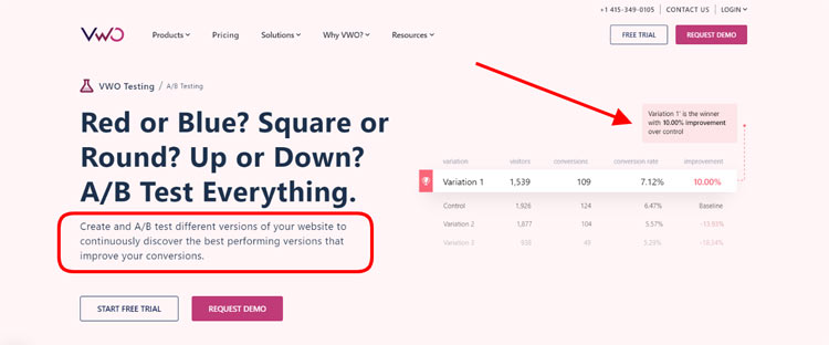
For instance, you want to know which option works better: a blue button with the white CTA text “Browse More” or a white button with the blue CTA text “Sign Me Up”. You can run a test by putting up several versions of the page featuring the aforementioned options and split what your audience sees, say, 50/50.
It’ll take time to run your experiment. And the longer the timeframes you set, the more accurate and trustworthy results you’ll get. You can then see which option attracted more interest and make conclusions on what to use for the purposes of optimizing your online store’s conversion rate.
Final Say
Staying fresh and concise with your calls to action is one part of the deal. Finding what truly works for your individual eCommerce store’s audience is another. Test out your CTAs to find which attention-grabbing buttons or calls convert better. Try to make them irresistible and impossible to ignore. And don’t be afraid to run some experiments, after all, a change in as little as one detail can bring you fascinating results!





Leave a Reply